Bells & Bars.
Bells & Bars is so much more than just a functional Gym. They promote the healthy way of living and they spread an incredible vibe. Their members have become one big family, motivating each other to go the extra mile. They welcome each and every new member (not only the real atletes) with the greatest enthusiasm.
They're really into vintage strong man posters, but on the other hand their way of working is very modern, new and fresh.
So a fresh branding with a touch of vintage seemed the way to go.
The logo
The logo is inspired by vintage poster designs and consists of 2 elements:
The "Bell", which is the very obvious kettlebell right in the middle of the logo, and the Bar, formed by the letters of the logotype (only to be found by those looking for it).
The "Bell", which is the very obvious kettlebell right in the middle of the logo, and the Bar, formed by the letters of the logotype (only to be found by those looking for it).
The fist shaped hand holds the kettlebell, but in addition it stands for the "winning" mentality of the Bells & Bars team, coashes and members.
Some variations on the logo consist of:
an emblem/logomark, to be used as an avatar or in a square logo space, preferably with the option to add the logotype as text separately.
a logotype, to be used as a baseline for graphical or illustrated content, which already is a bit much to register.


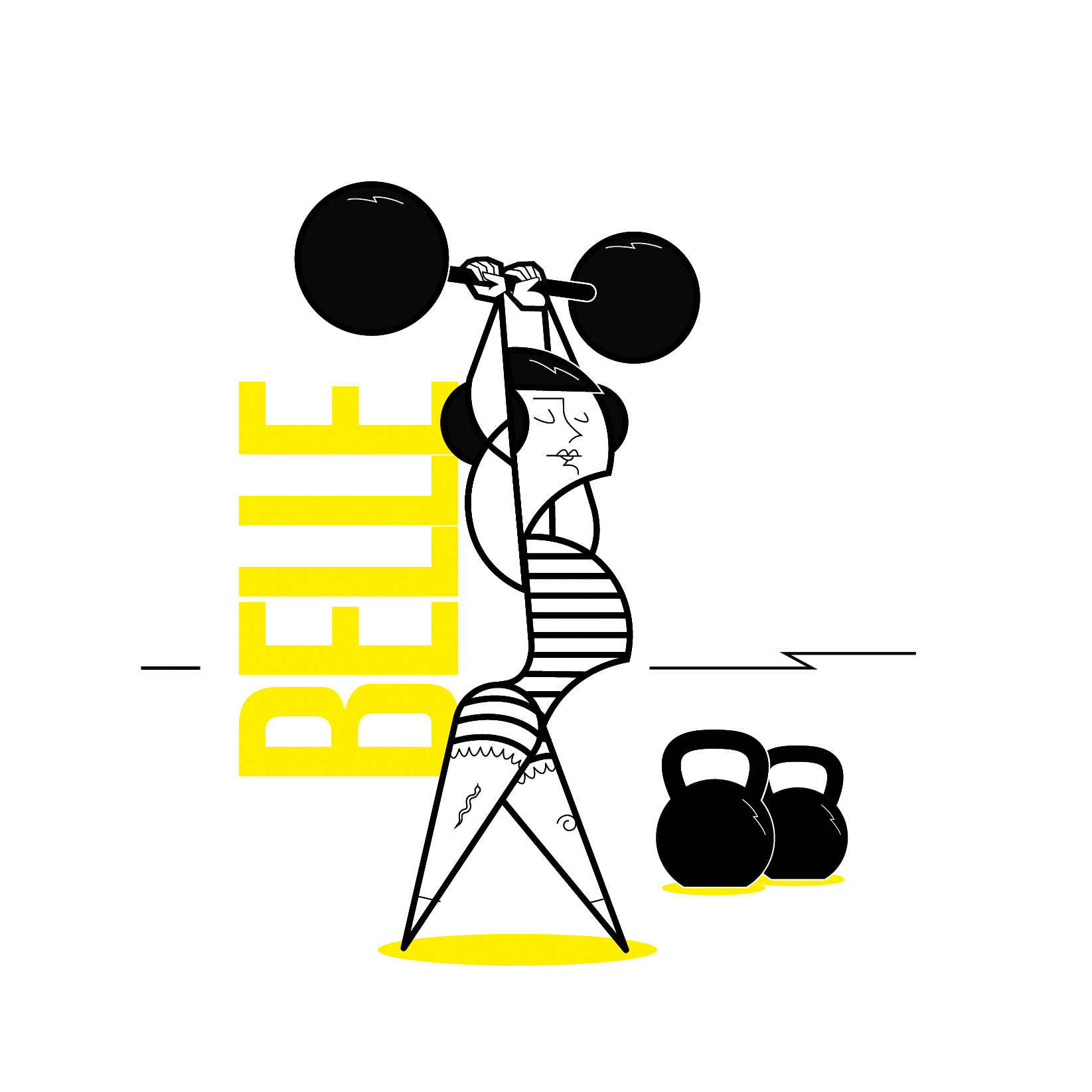
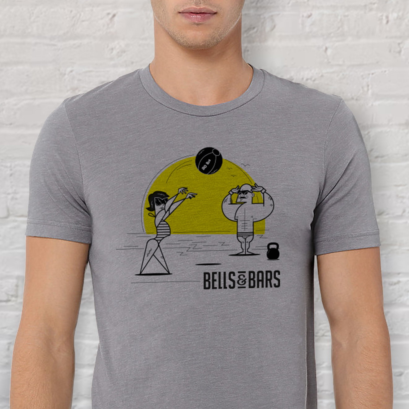
Meet Belle & Barry


To support the visual communication I often like to use mascots. They can be a fresh and funny addition to any communication. For each event a new illustration starring Belle and Barry is created. They show up on banners, t-shirts, socials and even on lavatory doors...


Business Cards
The original style and personal touch of the illustrations on their business cards make them stand out of crowd.
